Design matters

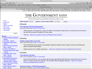
8 years ago to the day, one of my longest running projects was turned on: TheGovernmentSays.com. The aim was to make it impossible to bury bad news – if you were interested in a topic, you got told about it. At the time, it looked like it had been designed in 2004 (it had):

A vast amount has changed in 8 years, and in the interim, it has generated a huge archive of UK Government news releases. When the Central Office of Information was closed down in summer 2012, the central feed of news died, and is slowly being resurrected by the Government Digital Service as part of GOV.UK. GDS coverage will become more complete over the next year as the rest of Government begins to migrate onto the Gov.UK platform. However, GDS has specifically made the decision not to “do” email alerts for news, and leave that to external organisations. The main supplier of which (I’ve forgotten their name), charge money.
This isn’t a unique service any more as it was in 2004, and I’m not sure if there’s a huge amount of point continuing it. But with no publicity, it’s still got 900 active subscribers, so it has some use.
How I made the site look half decent
One of the things I’m aware that I’m incredibly bad at is design. However, the ever innovative Anna Powell-Smith has written this incredible design piece for geeks (like me). It’s value comes not only from saying what specifics of design matter, but the concrete steps needed to actually achieve them. Entitled “How to make your site look half decent”, it gives you everything you need, via cut and paste, to pretty do what it says it does.
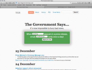
Thanks Anna, with about half an hour’s work, TGS looks set for another 8 years of me not looking at the design:

And for those who remember history, the new default colour scheme isn’t entirely accidental.
 Disruptive Proactivity